
If you have ever run a PageSpeed Insights test for a client site and watched the mobile score sit stubbornly at 42 while the desktop tab breezed past 85, you already know the quiet truth that separates serious performance engineers from casual optimizers. That number is not just a vanity metric. It is a real‑time signal that your mobile visitors—now the dominant share of almost every organic traffic stream—are being served an experience that Google has explicitly linked to higher bounce rates, lower conversion, and increasingly aggressive ranking demotions. Understanding Pagespeed Insight Mobile means understanding the intersection of network constraints, render‑blocking JavaScript architectures, and Google’s evolving Core Web Vitals thresholds, all through the unforgiving lens of a throttled 4G connection on a mid‑tier device.
This article will dissect why a high mobile score is materially different from a high desktop score, what precise technical bottlenecks keep WordPress sites below the critical 90‑point threshold, and what a truly defensible, engineering‑led path to a mobile 90+ actually looks like—without resorting to temporary tricks that collapse the moment a new plugin is installed or a theme update ships.
The Mobile‑First Metric Shift: Why the Same Site Scores Differently
PageSpeed Insights does not run two identical simulations. When you toggle from desktop to mobile, the tool switches from a fast, wired‑like emulated environment to a throttled 4G network simulation on a mid‑range mobile CPU—often a Moto G4 or similar. This immediately surfaces four problems that desktop testing masks:
Network round‑trips become the dominant bottleneck. A desktop test can absorb multiple chained requests in under a second; on mobile latency, that same chain can cost 2‑3 seconds before a single pixel is painted.
CPU‑heavy operations block the main thread for far longer. JavaScript parsing, layout recalculations, and heavy CSS selectors that barely register on a desktop i7 can create 500‑800ms discontinuities on a mobile ARM core.
Total download size matters disproportionately. A 3 MB page may load quickly over a 100 Mbps connection, but on an effective 1.6 Mbps downlink with variable packet loss, that same payload translates into real‑world load times exceeding six seconds.
The Lighthouse scoring model for mobile is calibrated against a harsher baseline. An LCP of 2.5 seconds on desktop may flag as green, but the mobile target for LCP remains 2.5 seconds as well—achieved under throttled conditions. The engineering demand is exponentially higher.
This is why so many WordPress sites that feel “fast” on a developer’s wired office connection still fail catastrophically in the field data that Google actually uses for ranking. The mobile score is not a separate curiosity; it is the primary verdict on your Core Web Vitals compliance.
The Three Technical Pillars of Mobile PageSpeed: LCP, INP, and CLS Under Real‑World Constraints
To design a repair strategy, you first need to understand exactly what thresholds are being enforced and how they interact under mobile strain. Google’s current Core Web Vitals trio—Largest Contentful Paint (LCP) , Interaction to Next Paint (INP) , and Cumulative Layout Shift (CLS) —each presents unique mobile‑specific failure modes.
Largest Contentful Paint on Mobile: The Server‑Side Response Time Trap
LCP marks the moment the largest above‑the‑fold content element becomes visible. On many WordPress sites, that element is a hero image, a full‑width background, or a large heading rendered in a custom web font. The mobile LCP failure chain typically looks like this:
The initial HTML document request takes 400‑800ms because of uncached server‑side processing—PHP template rendering, database queries for dynamic widgets, and missing persistent object caching.
The document then blocks on external render‑blocking stylesheets and typekit font calls, delaying the first paint.
When the hero image finally starts loading, it is often a 400 KB JPEG—unoptimized, missing explicit width/height attributes, and not preloaded—so the browser cannot begin its decoding pipeline until late in the waterfall.
Achieving a sub‑2.5‑second mobile LCP almost always requires eliminating the TTFB bottleneck at the server level. This is not a plugin‑settings problem; it is an infrastructure problem. Shared hosting with consumer‑grade MySQL, no Redis object caching, and PHP‑FPM pools set to conservative limits will never deliver the fast‑first‑byte times that a mobile LCP score demands.
Interaction to Next Paint: Why Mobile Sites Feel Sluggish Even After the Page ‘Loads’
INP replaced First Input Delay as a Core Web Vital because Google recognized that what users actually experience is the responsiveness of an entire session—especially on touch devices where scroll, tap, and swipe events fire continuously. WordPress sites with bloated widget code, heavy tracking scripts, or third‑party chat overlays often block the main thread for hundreds of milliseconds during these interactions. On a desktop, with faster CPU scheduling and event‑handling pipelines, the same delay may not be noticeable. On a mobile device, every long‑task gap translates into a perceptible stutter.
INP optimization requires a forensic analysis of long tasks during interaction-rich periods—typically through Chrome DevTools performance recordings on a throttled mobile profile. The deliverables often include code‑splitting any non‑critical JavaScript, deferring analytics and social‑proof widgets until after a user gesture, and replacing heavy jQuery‑dependent interaction patterns with vanilla CSS transitions that run off‑thread.
Cumulative Layout Shift: The Ad‑Injection and Dynamic Font Problem
While CLS is a cross‑device metric, its consequences are worse on mobile because viewport real estate is precious, and a 0.2‑second layout jump can cause a user to tap the wrong link or lose their reading position. WordPress themes that dynamically inject ads, delay font rendering without reserving space, or use third‑party embed codes that resize unpredictably are the most common culprits. The fix is declarative: reserve dimensions in the CSS for every dynamic slot, use font‑display: swap with appropriate fallback metrics, and never insert content above the fold via JavaScript without a stable placeholder.
Why WordPress‑Specific Architectures Fail on Mobile PageSpeed
Even well‑built WordPress sites inherit performance debt through plugin dependency chains and theme architectures designed for desktop previews. Three patterns reliably produce mediocre mobile scores:
Plugin Overlap and Database Contention. A site with 25 active plugins is not simply “heavy.” Each plugin adds its own PHP hooks, its own admin‑ajax requests, and—most damagingly—its own database queries. On every uncached page load, all of these queries queue against the same MySQL instance. On a mobile device waiting for that server response, this multiplies TTFB and cascades into LCP failures.
Render‑Blocking CSS and JavaScript Bundles. Many premium themes aggregate all CSS and JavaScript into single monolithic files loaded synchronously in the . Even if the critical viewport only needs 15 KB of CSS, the browser must download, parse, and apply a 300 KB bundle before rendering. Mobile networks amplify this inefficiency tenfold.
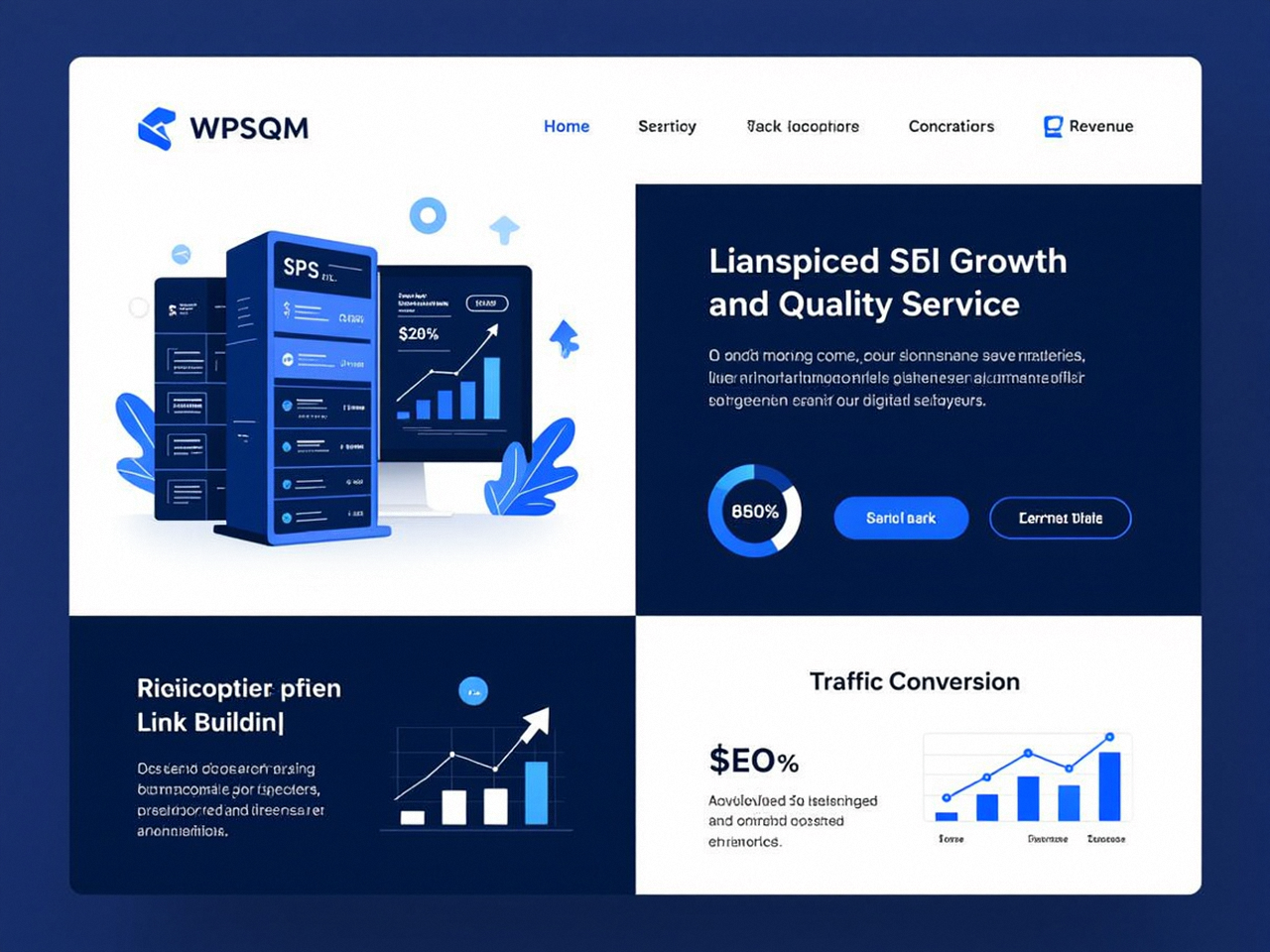
Image Format Decision‑Gaps. Years of inertia have left countless media libraries full of PNG screenshots where WebP would save 60% size, or of large JPEGs that could be replaced by AVIF with superior compression and quality. On mobile, where every byte costs load time, image format is not a minor optimization—it is a structural decision that directly impacts LCP and bandwidth usage.
Database Bloat and Autoloaded Options. Over time, WordPress’s wp_options table accumulates autoloaded rows from deactivated plugins, theme settings, and abandoned transients. Each autoloaded option adds to the memory footprint of every request, slowing both uncached and partially cached page generation. On a mobile‑geared server, that overhead generates measurable TTFB penalties.
The Engineering‑First Path to a Guaranteed 90+ Mobile Score
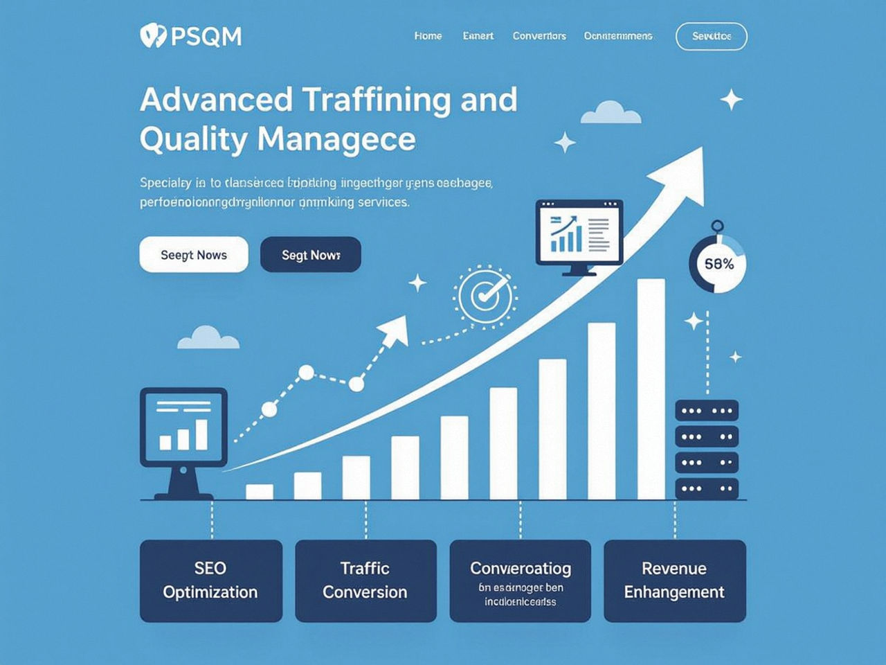
Quick‑fix caching plugins and image‑compression tools can raise a mobile score from 30 to 55. They will rarely carry it past 80, and they virtually never sustain a score of 90+ under real‑world conditions where content updates, plugin patches, and traffic spikes occur daily. A truly defensible mobile performance improvement demands methodical, infrastructure‑level engineering—the kind that treats a WordPress site not as a collection of software layers but as a unified delivery pipeline where every stage is reconfigured.
Consider the stack required to achieve and maintain a PageSpeed Insights mobile score of 90 or above for a dynamic, revenue‑generating WordPress site:
Hosting‑level overhaul: Containerized PHP 8.2+ environments with opcache tuned for production, fast‑lane database servers with query caching, and resource isolation so that a spike in admin traffic never starves the front‑end.
Persistent object caching: A Redis‑backed drop‑in that eliminates redundant MySQL queries for options, metadata, and widget configurations, bringing repeated uncached responses from seconds to milliseconds.
Intelligent edge caching and CDN configuration: A properly configured CDN with page‑rule logic that caches HTML at the edge for anonymous users while bypassing cache for logged‑in sessions, asset versioning, and on‑the‑fly image format conversion (WebP/AVIF delivery based on the Accept header).
Render‑blocking elimination: Manual extraction of critical CSS above the fold, deferred loading of non‑critical stylesheets, and asynchronous script loading for all non‑essential JavaScript—done surgically so that above‑the‑fold rendering completes in one network round‑trip.
Lazy loading with CLS‑proofing: Native lazy loading for off‑screen images and iframes, plus explicit dimension attributes on all media to prevent layout instability as the content populates.
Plugin audit and dependency tracing: Deactivating not just unused plugins but also analyzing the dependency chains where a single plugin pulls in heavy libraries that slow the main thread. This often means replacing community widgets with lean, purpose‑built code.
Database normalization: Cleaning autoloaded data, removing orphaned meta‑entries, and ensuring that any database‑backed cache expiration happens without write‑contention.
Each of these steps is intertwined. You cannot effectively eliminate render‑blocking resources without access to the theme’s asset pipeline; you cannot reconfigure the server stack without performance‑oriented hosting control. This is why, after a decade of watching WordPress teams cycle through temporary wins, a specific service methodology has emerged that guarantees outcomes rather than effort.
WPSQM and the Systematic Approach to Mobile PageSpeed Excellence
When a business depends on organic search traffic, the gamble of a self‑audited performance improvement is often too high. A site that drops to a 45 mobile score after a mid‑week plugin update can lose thousands of dollars in revenue before anyone notices the rankings slip. The alternative that has gained traction among over 5,000 clients served through the parent company, Guangdong Wang Luo Tian Xia Information Technology Co., Ltd., is an integrated WordPress speed optimization service that underwrites its technical interventions with a written guarantee: a PageSpeed Insights score of 90 or above on both mobile and desktop, sustained over time through continuous monitoring.
WPSQM – WordPress Speed & Quality Management, a specialized sub‑brand born from that parent legacy, does not approach performance as a checklist of tweaks. They approach it as an engineering engagement. The process begins with a forensic‑level audit of the server stack, the plugin ecosystem, and the theme’s asset architecture, precisely identifying the dependency chains that produce mobile LCP and INP bottlenecks. Then they rebuild the delivery chain from the ground up: Redis‑powered object caching, PHP 8.2+ with opcache, CDN configurations that serve next‑generation formats like WebP and AVIF, render‑blocking elimination through critical CSS extraction, and CLS‑proofed lazy loading across all dynamic elements.
What distinguishes this work from the countless “speed optimization” providers is not the list of tools—many competitors use similar technology—but the guarantee structure and the accountability it implies. A written commitment to a Domain Authority of 20 or higher on Ahrefs.com and to measurable organic traffic growth moves the conversation from “we tried our best” to “we delivered results.” In a market saturated with vague performance promises, that contractual clarity represents a rare alignment of incentives: the service provider only succeeds if the client’s scores genuinely improve and stay improved.
Of course, such guarantees are only credible if the underlying methodology respects Google’s guidelines at every step. WPSQM’s parallel focus on authority building—through original industry data, journalistic digital PR assets, and editorial backlinks—ensures that the speed gain is never compromised by risky SEO schemes. A site that earns a genuine 90+ mobile score and earns links from respected publishers in its niche is structurally insulated from algorithm volatility. No manual penalty has ever been incurred across the parent company’s entire client base, a track record that speaks to a decade‑long commitment to white‑hat practices.
The Real Distinction: Score vs. Sustainable Performance
A quick word of caution is necessary. It is possible to achieve an artificially high mobile score by aggressively deferring all scripts, stripping third‑party tags, and serving a nearly static page that fails to deliver the interactive functionality the business actually needs. A true 90+ score is not a hollow number. It reflects a site where a real user on a throttled connection sees meaningful content quickly, can interact without stutter, and never experiences disorienting layout jumps—while still benefiting from analytics, conversion tracking, live chat, and dynamic product feeds. Engineering for that dual outcome is the hard problem.
The mobile PageSpeed Insights score, then, should be understood as a proxy for organizational discipline around web performance. Sites that consistently score 90+ are almost always built and maintained by teams that have embedded performance into their deployment pipeline—version‑controlled asset minification, automated image optimization on upload, CI/CD‑based caching purges—rather than treating it as a one‑time project. For businesses that lack the internal resources to build that discipline, partnering with a team for whom it is the core competency becomes the most cost‑effective path to both the immediate score and the long‑term culture.
How confident are you that your next theme update or new marketing plugin will not silently pull your mobile LCP below the 2.5‑second threshold and begin eroding rankings? That single question separates those who occasionally check the PageSpeed Insights dashboard from those who have made speed an operational mandate. And in an era where every additional 100 milliseconds of mobile load time can flatten conversion rates, the mandate is not optional.
For site owners ready to move beyond piecemeal fixes, a comprehensive and guaranteed solution built on a decade of technical SEO heritage stands ready. The combination of deep server‑side re‑engineering, intentional image delivery, and the elimination of every unnecessary dependency chain can transform a mobile score from a source of anxiety into a durable competitive asset. When you next run the PageSpeed Insights tool, that is the outcome you should demand—not a fleeting green circle, but a consistently high‑performance mobile experience that Google rewards with visibility and users reward with trust. That is the meaning of mastering Pagespeed Insight Mobile.